Check Out Some Of The Alternatives To The New TVM Logo By Competition Applicants
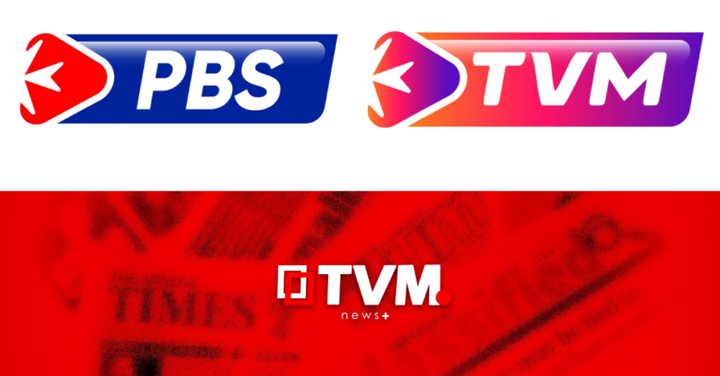
TVM has just picked the winner of its somewhat controversial graphic design competition that decided the fate of the brand’s new logo, and some of the other applicants have gone to Facebook to post their own creations.
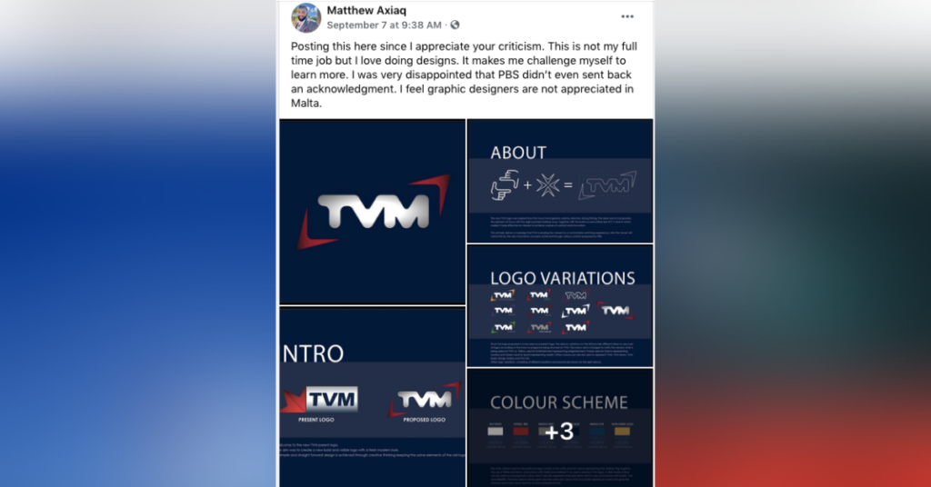
“I was very disappointed that PBS didn’t even send back an acknowledgment. I feel graphic designers are not appreciated in Malta,” said applicant Matthew Axiaq in a Facebook post.
At the end of July, PBS launched a public competition for ideas on the new logo. And from a total of 21 submissions by individuals, students and companies, the design of the company beespoke took the crown.
Designer Ryan Calleja explained that the winning team wanted to include Malta’s cross and the symbol of media play as a forward moving icon.
“We created and selected a font that matches with this logo which we submitted and won,” he proudly declared.
However, there were another 20 designs that have been left unseen by the public and four talented creators were eager to change this.
Katya Azzopardi, Matthew Axiaq, Andre Farrugia and Reno Cucciardi all took to Facebook to share their designs following a post on the popular page Graphic Design Malta encouraging applicants to do so.
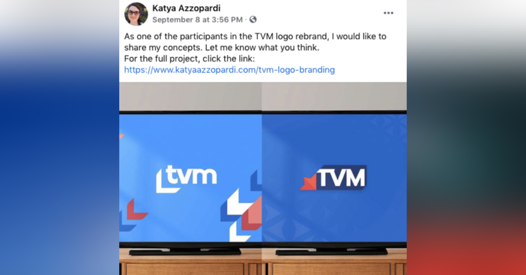
Katya Azzopardi
“As one of the participants in the TVM logo rebrand, I would like to share my concepts. Let me know what you think.”
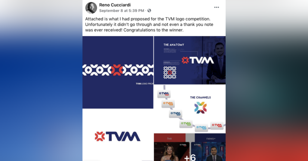
Reno Cucciardi
“Attached is what I had proposed for the TVM logo competition. Unfortunately it didn’t go through and not even a thank you note was ever received! Congratulations to the winner.”
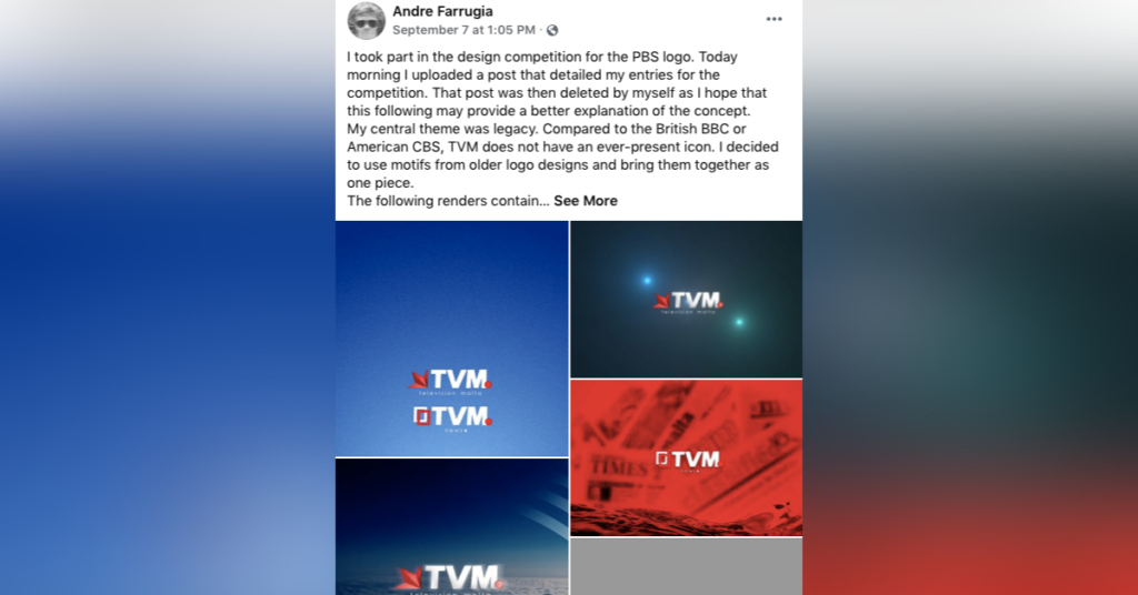
Andre Farrugia
“My central theme was legacy. Compared to the British BBC or American CBS, TVM does not have an ever-present icon. I decided to use motifs from older logo designs and bring them together as one piece,” he explained.
“The following renders contain material that was included in the original document, as well as a couple of identical mockups that weren’t,” he continued.
“Each of these made use of several elements, most notably a light emphasis on skeuomorphism to imply depth and contrast. However, the design is versatile enough to be presented in monochrome if desired.”
Matthew Axiaq
“Posting this here since I appreciate your criticism. This is not my full time job but I love doing designs. It makes me challenge myself to learn more,” he said.
He continued by explaining his frustration at the lack of recognition he received and subsequent lack of appreciation for the art form. He wasn’t alone in this opinion.
Several commenters shared his sentiments of there being a lack of acknowledgement when it comes to graphic design.
Some even posited that competitions that encourage free work actually end up devaluing it.
“What other professional in any industry in the world works for free? Does your doctor? Your Wolt driver? Even your priest? I think not.”
What do you think of these alternative designs?
