Local Graphic Designer Brings Disappearing Maltese Typography To Life In London

Maltese graphic and brand designer Hannah Grech Pirotta recently brought the fading Maltese typography to life in a London exhibition.
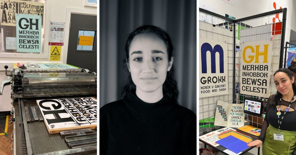
Hannah just showcased her final thesis project at the London College of Communication within the University of the Arts, London, after having successfully completed a 15-month-long Master’s programme in Graphic Branding and Identity.
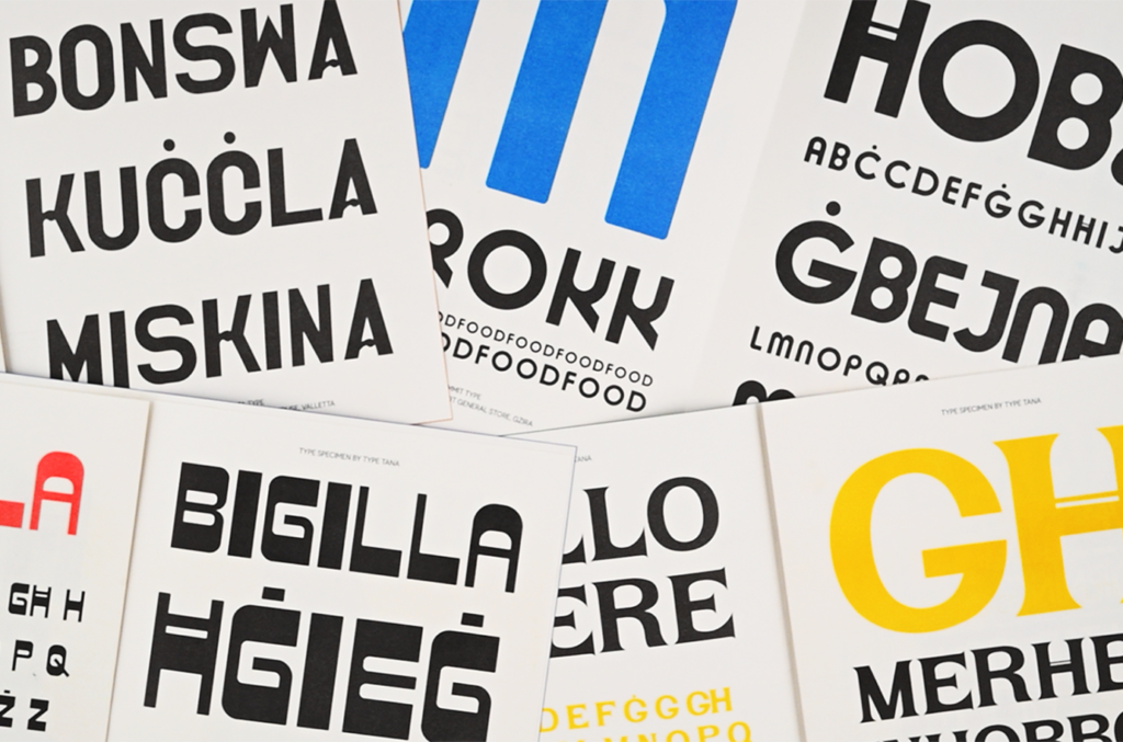
As part of the project, Hannah developed the brand ‘TYPE TANA’ – an archive and type foundry aimed at celebrating and preserving Maltese typography, that aspires to disseminate Maltese visual culture.
“TYPE TANA was born to celebrate and protect the rich and colourful design heritage cultivated by our little island of Malta,” Hannah told Lovin Malta.
The project features five custom typefaces that Grech Pirotta developed based on type signs from the streets of Malta.
“By capturing an element of Maltese design, I hope designers can find inspiration in what came before them, to help them create what comes next,” she continued.
“In the current relentless wave of development, so much of our rich design history is being lost forever, as wonderful and traditional shop signage each with unique and hand-crafted characters are being replaced by new developments – in the process disappearing from our streets and consequently the public eye,” Hannah told Lovin Malta.
“Through this project, I was really seeking to immortalise the letterforms, and give the characters the opportunity for a new lease of life,” she said.
She hopes to continue to grow this repertoire of typefaces, taking inspiration not only from shop-front signs, but vintage marketing material, food packaging, and ephemera.
Her exhibition piece featured a short run of Letterpress posters with the specific type on display, as well as a Risograph printed type specimen leaflet.
The experience of using these traditional printing techniques has been one of the highlights of Hannah’s experience at the London College of Communication, previously known as the London College of Print.
“There is so much good that can be added to a project by doing it by hand. I’ve learned that combining various printing techniques with digital design adds character to the project, as well as creates a link to the craftsmanship which created the type signs in the first place,” she expressed.
With the brand name being a stylised translation of “Our Type,” the project was driven by the designer’s desire to explore her sense of identity linked to home and Malta’s own collective identity.
Hannah Grech Pirotta was a beneficiary of the Malta Arts Scholarships Scheme and the Janatha Stubbs Foundation. You can view her work on www.hannahgrechpirotta.com and on Instagram at @hgp.design
Tag someone who needs to know about this!