Building Malta’s Visual Identity, One Block At A Time
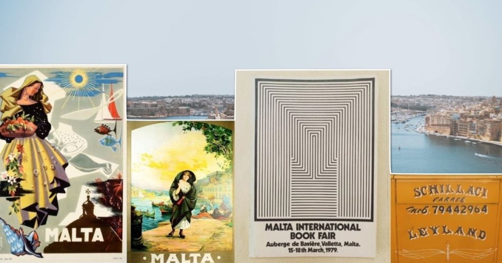
What does something Maltese look like? Was there ever anything close to a Maltese visual language? Actually, what is ‘Maltese’ anyway?
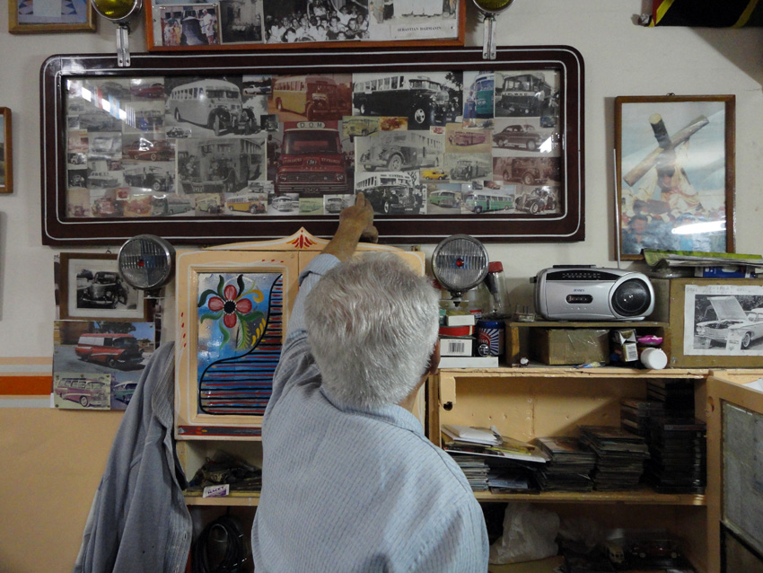
Tberfil artist Bastjan Darmanin's workshop with his influences clearly on display - photo by Steven Scicluna
Around a decade ago, when the orange and yellow buses were still running, I had decided to start documenting the artwork that used to be painted onto the buses.
Even as a regular bus user, I remember taking tberfil sort-of for granted until the moment when it became clear that their days were numbered, and only then did I become aware of its singularity. It also seemed to be indigenous to our islands, at least judging by the few years I had already spent living abroad by that point.
As a graphic designer and illustrator, documenting tberfil from a distance was my way of exploring my national identity, both on an individual level and also a collective one.
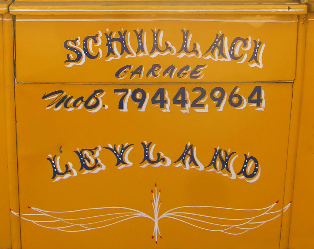
Joe 'Zuzu' Farrugia's various tberfil lettering styles on an old bus, 2008 - photo ny Steven Scicluna
Themes surrounding national visual identity and what makes Malta look ‘Maltese’ have clearly been on the mind of many individuals in recent years, perhaps in response to the country’s blind economic growth and all the cultural and geographic looting that has come along with it.
Online documentation projects such as the long-running MaltaType, Salvu Scerri Archives and many others have sprung up out of this wave of interest, each project focusing on a different aspect of 20th-century Maltese aesthetics.
View this post on Instagram
These documentation projects seem to be filling in a gap that we might not have known existed. While the country’s history of fine art is visibly very well documented and catered for (although arguably only till a certain era), information about our graphic art and design heritage is either highly fragmented or non-existent. As a design student at MCAST in the mid-2000s, I learned everything about American and Italian graphic design but literally nothing about Maltese design.
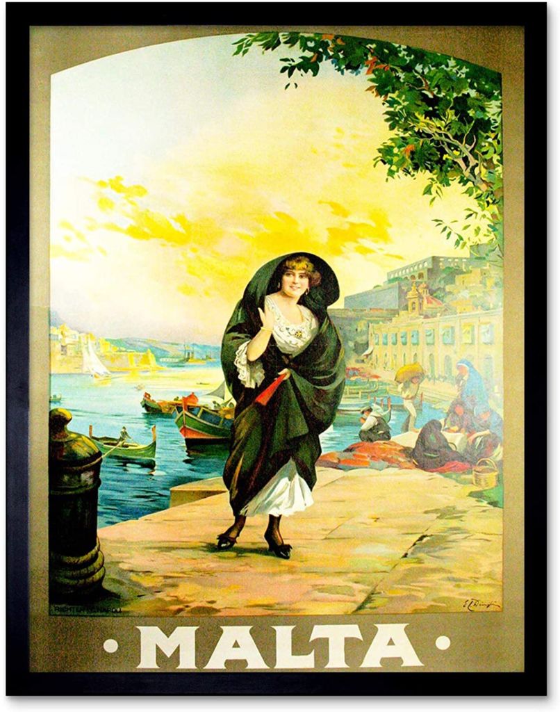
Promotional Malta poster by Edward Caruana Dingli, 1925. A classic example of the way sold itself in colonial times
But exactly why is it so important to know about our very own graphic art and design history?
There are many ways in which this question can be answered, but let’s keep in mind that the design history of a particular country is intimately tied to its economical and social history, developed in the context of an array of influences starting from spoken languages to climate.
In Malta’s case, tberfil flourished in the cracks of an archaic bus ownership system adopted by the transported authorities over the years, and stylistically drew upon both colonial lettering styles and homegrown tberfil tal-karrettuni.
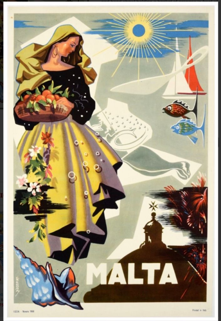
5. Malta poster by Emvin Cremona - 1964. Created on the cusp of Malta's independence, was this poster any different from Eduard Caruana Dingli's version?
If the history of graphic design reads as a history of visual problem solving, then a history of Maltese graphic design – as limited and underdeveloped as it might be – is a guide to how past generations of graphic artists have approached and solved visual problems that are unique to our country.
As a student about to join the local design industry, familiarity with the poster work of Emvin Cremona or the lettering found on local vintage bottle label designs might have given me just the preparation I needed to solve local design problems on local terms, rather than on foreign ones.
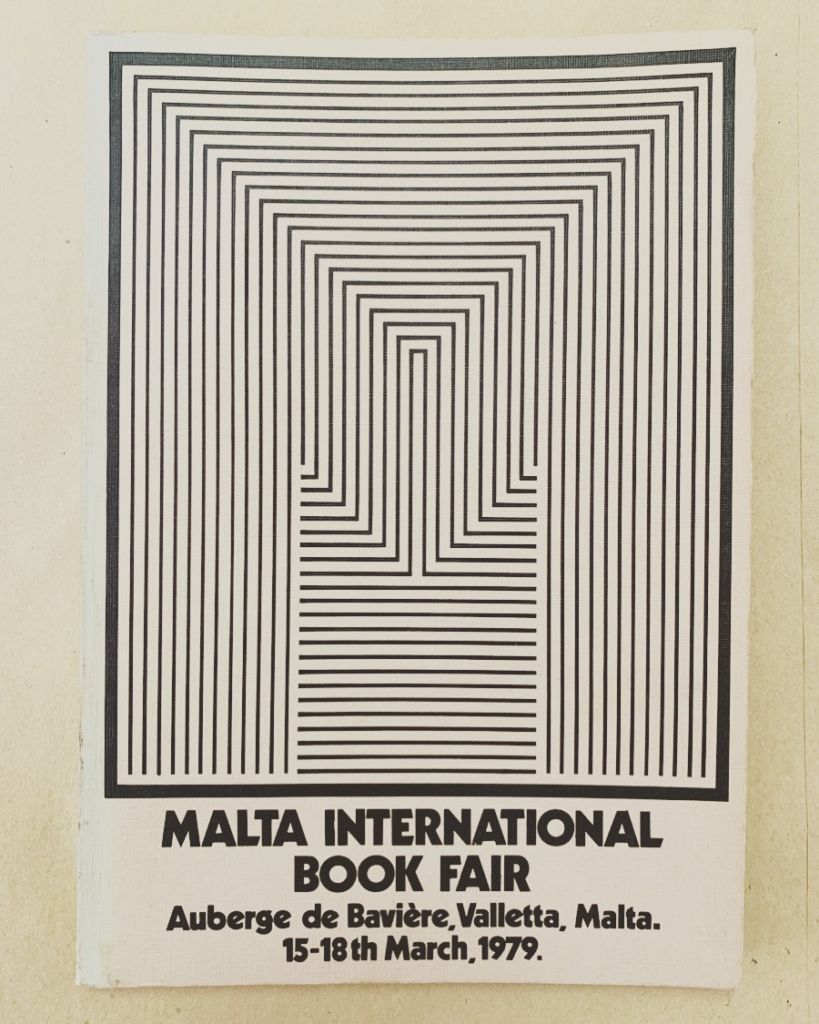
6. Malta International Book Fair poster, 1979 by Norbert Attard. A rare attempt at something a bit different
This is the sort of bedrock knowledge that, for example, might give an art director the insight needed to look beyond employing overused visual stereotypes such as the Maltese Cross, luzzu colour schemes or neolithic spirals when designing a new corporate identity.
It’s the sort of knowledge that comes in useful to local authorities when developing engaging design briefs for local design studios, artists or other creative professionals.

Air Malta's latest rebrand by branding agency Futurebrand, 2012. A missed opportunity or a bold new look?
A country that knows its strengths, peculiarities and limitations is able to approach certain decisions much more effectively, with the results often being unique and in possession of a certain harmony – visual, in the case of graphic design.
This is precisely what makes world-renowned design cultures such as Swiss typographic design, Japanese graphic design or Italian industrial design stand out.
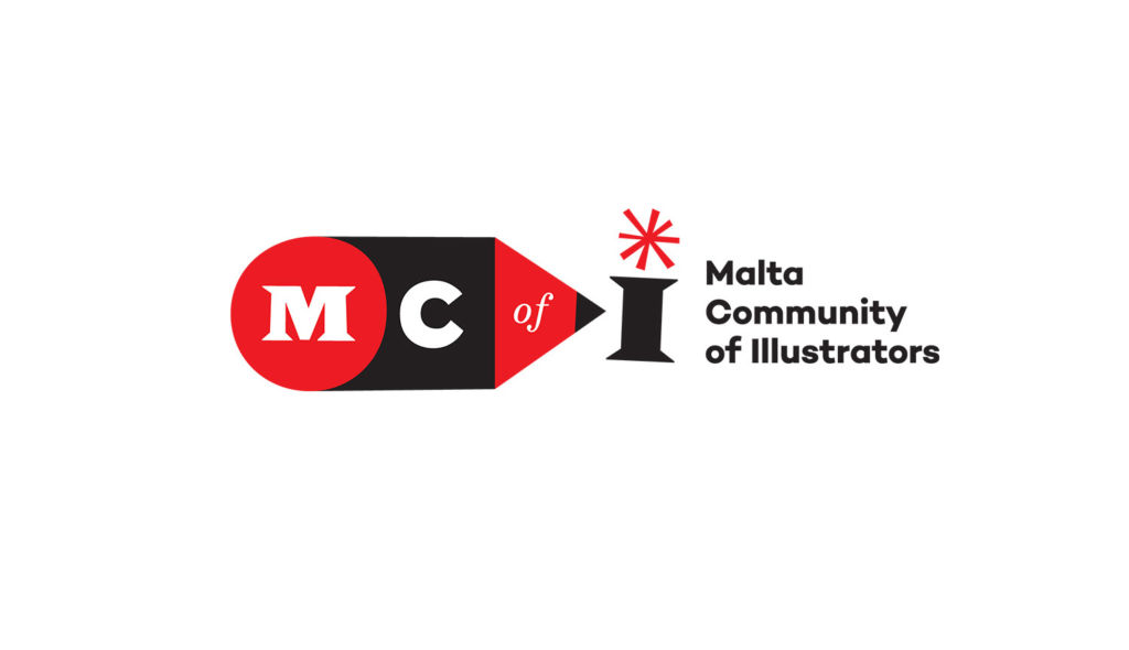
Identity for the Malta Community of Illustrators, by Steven Scicluna, 2020. Rather than referencing a Maltese Cross, the 'star' takes inspiration from Malta's firework tradition.jp
These are some of the aims behind Visual Building Blocks: essays on Maltese graphic arts 1950-1980 – a project that aims to unite the existing research work of individual documentation projects and produce a cohesive body of work about the history of Maltese graphic art and design.
While this research will not pretend to be an exhaustive overview of Maltese design history, it is hoped that it will provide a much-needed backbone to debates and education surrounding themes of national visual identity, by offering insights into where it has come from and asking important questions about where it is heading.
View this post on Instagram
With Malta currently facing huge internal pressure to treat its intangible culture with more respect and understanding as it races into the future and finally having the resources and hindsight to do so, the time is ripe for a project of this scope to happen.
View this post on Instagram
Visual Building Blocks is a research project supported by Arts Council Malta.
Steven Scicluna is a graphic artist and illustrator, with experience working in Malta, London and Spain. He is a founding member of the Malta Community of Illustrators and is currently leading the Visual Building Blocks research project. He is based in Valencia, Spain.
Project group page and further links:
https://www.facebook.com/groups/2885087371818814
Do you agree? Comment below
