‘Completely Unimaginative’: Maltese Designer Reacts To PL And PN’s Electoral Campaign Logos

Maltese communications academic, author and digital artist Ġorġ Mallia has reacted to the recently launched electoral logos for the Labour Party and the Nationalist party – and it’s safe to say that he was not impressed.
While answering questions from Lovin Malta, Mallia gave his comments on the two electoral logos, which were launched together with the announcement of the general election, set for 26th March.
“Completely unimaginative – they’re both pretty rough. PLs is slightly more ‘designed’ than the PN’s,” he told Lovin Malta.
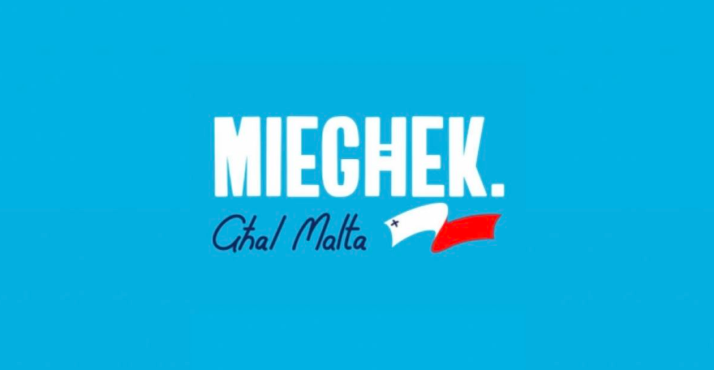
The Nationalist Party’s Logo

“The Partit Nazzjonalista logotype is a bit all over the place. Using two fonts and then separating the words written in them means that there is no visual cohesion. Add one more element (the unfurling Maltese flag) and you have something that just does not hold together,” he said.
“The choice of fonts is very ‘traditional’, opting for a chunky sans serif and a script font that could have worked together had there been some attempt at integration.”
“The George Cross on the flag looks like it’s been hastily drawn on with a biro,” he said.
“Not a fan of the logotype as a whole,” he concluded.
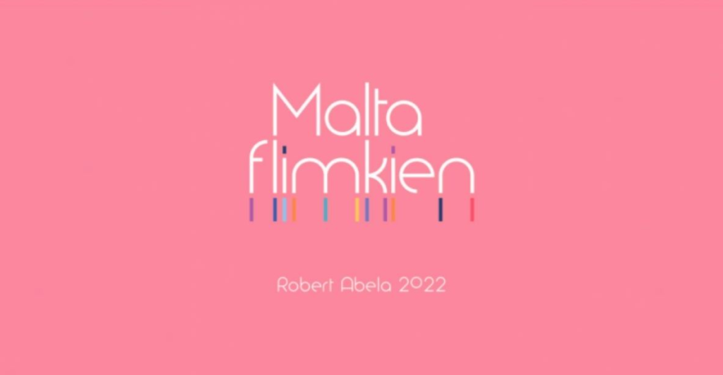
The Labour Party’s Logo

“The Partit Laburista logotype is more ‘contemporary’ in its choice of font – not bolded, and linking the two lines of text through a sort of Gestalt closure link between the descender of the top ‘M’ and the bottom ‘l’ and then the top ‘l’ and the ascender of the bottom ‘k’,” he said.
“Quite clean and unified. What fails, in my opinion, are the extending multicoloured lines below ‘flimkien’, hinting at the PL’s LGBTQ support, perhaps? A need to unify community diversity?” he questioned.
“There might be meaning in it, but it throws the design of the logotype, dragging the overlying text down visually. I think they overstated. Having the dots in ‘flimkien’ coloured would have been enough,” he said.
Mallia concluded by saying that both parties could have done better with the slogans.
“It’s not as if they did not have time to plan their visuals,” he said.
Mallia is a Maltese academic who is also in love with books, comics, cartoons and anything that’s media-related. At the moment he is an Associate Professor and also the head of the Department of Media and Communications at the University of Malta, where he lectures in design, illustration, visual narrative, and personal communications.
What do you make of Ġorġ Mallia’s criticism?
