Malta, We Need To Talk About Our Identity
Aesthetically, we have produced a mess. From bright yellow and red bridges to zig-zagging floors on village piazzas, it seems that the concept of context and respecting the existing environment is alien to some. But I don’t need to get into the subject of architecture and urban development. It’s not my area of expertise… and I’m sure that the subject will pop up on your Facebook feed on the next refresh.
This virus has found its way in graphic design too, especially within government entities, some of which should be the epitome of good design practices. Entities should be leaders that educate the Maltese public on what good design should and can be. Heck, these are even the very organisations tasked with producing our next generation of designers.
There has been a lot of talk about Maltese identity lately, at least within the design and cultural community. I feel this conversation has become more defined and appreciation (usually for the old) is becoming more common. Could it be that we are coming to terms with who we really are simply by producing poorer work than we used to? Somehow we are now craving whatever made us really Maltese and we seem to want more of it, but we’re only getting less. If it wasn’t for the work of some dedicated individuals who have decided to collect, preserve and share their appreciation with others, all of this would be just a memory in our parents’ minds. I am referring to small businesses and artists such as Stephanie Borg, Te fit-Tazza, Malta Doors, Lazarus Tiles, Maltatype and others of course.
Earlier this month we were blessed with MCAST’s new visual identity and (to put it mildly) their logo in particular isn’t pleasing to the eye. I won’t go into the technicalities of the type choices, lack of cohesion, or the meaning behind the symbolism, but suffice to say, to me this is a reflection of a much bigger problem.
Which brings me back to context.
Context in this case is the audience, the period, the media and the platforms where this brand’s identity is to be used. While colleges and universities across the world are rebranding and simplifying their centuries-old crests and emblems to adapt with the times and for more practical uses, MCAST took an opposite approach and designed a crest, which I’m guessing is trying to give us some sense of (non-existing) history? This tells me that proper research wasn’t carried out. The emblem itself is not such a horrible execution, so this wasn’t the kind of quick fix we’re used to. The problem is that this just doesn’t work and looks out of place and out of touch.

I’ve been trying to wrap my head around this to figure out what it is that we’re doing wrong. I am convinced that there are designers locally who are capable of handling such projects and producing great work. I know this for a fact because private businesses do receive better work. So doesn’t a national organisation deserve to be presented better? Especially when it is being presented to an international and wider audience?
It would be unfair to point the finger only at MCAST because they’re not alone. Just like MCAST, we recently saw Start in Malta’s visual identity, and we had MTA and also the Malta Philharmonic Orchestra a couple of years ago. Then there’s Tech.mt and Esplora. Let’s go through these ones by one because I truly believe they deserve their own spotlight.
Start in Malta
The Start in Malta branding exercise is more reminiscent of a childcare centre than a startup ecosystem (which is what they claim to be on their website). Again, context. Isn’t this supposed to attract the attention of entrepreneurs and investors? If I had to define this brand’s attributes based on this visual identity alone, I would think “childish, colourful, playful” — but that’s not somewhere an entrepreneur would want to launch their business, right? Don’t forget that we are competing with the likes of Estonia and Berlin here.

Visit Malta
Visit Malta by MTA was launched a few years ago. I remember the bid for the project and its selection criteria. The brand lacks depth and clearly no proper research was done to uncover the true identity of Malta. If that were the case, we wouldn’t be seeing yet another interpretation of the eight-pointed cross. That’s just lazy. And why is it called Visit Malta and not just Malta anyway?
Well executed branding projects can be spotted from miles away and they actually bring a return on investment. The Visit Malta logo just doesn’t work at smaller sizes, where it becomes unrecognisable and illegible. In fact, the oh-so-loved “Maltese cross“ disappears into obscurity on most of the brand’s digital applications. Now compare that to other countries below, and you be the judge.

I think the problem lies in the selection criteria of such branding projects. From experience, I know that a lot of these projects are tender based, and the cheapest quote is awarded the project. Yes, they actually reward the cheapest. Not the best. Not the most experienced. But the cheapest quote produces the cheapest work. That’s only logical. If the budget is a third of a decent project, then the result is likewise. (Although sometimes I feel that the results don’t match the budget at all, like the case of Visit Malta.)
Malta Philharmonic Orchestra
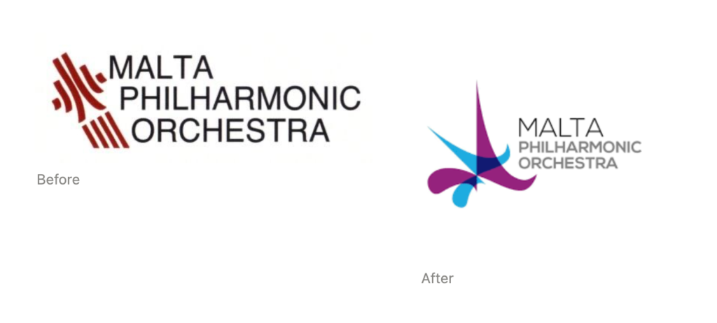
The Malta Philharmonic Orchestra was rebranded from a well-thought logotype to whatever you call those shapes. The original logo worked because it was classic, timeless, easy to describe and therefore easy to recall. The new one is abstract, uses an arbitrary colour palette, gives a sense of randomness, is stuck in time (somewhere in 2005) with sharp edges that could hurt if you get too close. Sharp is definitely not a brand quality that the MPO wants to aspire to. So, then one wonders, why was a rebranding exercise carried out in the first place?
Tech.mt
I received a call recently to list my business on Tech.mt’s website, so I visited it only to realise how familiar it looked… even though I had never been on their website before. This website is a close clone of another website, including layout and colour. The fonts are different, but I’m going to assume that this was intentional and not because the designer didn’t bother acquiring a license for a proper font and instead took a shortcut by using a free font.
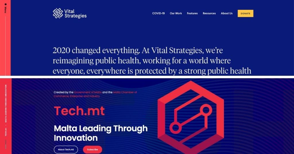
Tech.MT's website compared with anothers
Esplora
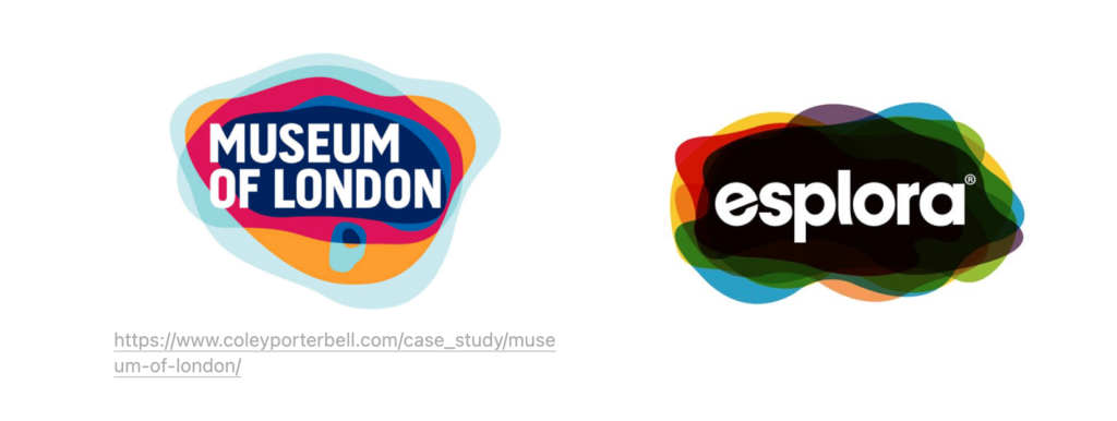
Now onto Esplora, because I always like to leave the best for last. Esplora is another copy cat. Here’s an excerpt from the Museum of London’s press release:
“The striking new logo, designed by award-winning agency Coley Porter Bell, takes the conceptual form of London’s thumbprint. Coloured layers map the shape of London over time, reflecting the ever-changing, diverse and dynamic makeup of London and Londoners, past, present and future. The brand mark has been crafted to create visual impact, and link the Museum venues.”
How can such a concept be applied to something completely unrelated and be justified and celebrated as an achievement? What makes the Museum of London’s brand powerful is its authentic narrative and it is this narrative that helps the brand come to life and become relatable to its audience. This is like trying to bake a cake you’ve only seen a picture of without understanding the recipe.
These are all the products of a flawed system. Whether the process is intentionally flawed to reward the chosen few, I don’t know. What I do know is that this system produces very poor results — and poor results cost money. The cost is every opportunity lost because someone wasn’t convinced to click the contact button on the website, or because the brand didn’t communicate a sense of professionalism and trustworthiness, or because every tourist missed the message on a Visit Malta ad that wasn’t clear enough.

So how can we solve this?
Two things.
First of all, start by rewarding quality. If government entities are going to keep running after the cheapest quote, the Maltese public will keep receiving the poorest work.
Secondly, appoint a board of experts who can look at a project from an objective point of view, NOT at the delivery stage but way before a branding project brief is even written. Sometimes, the people in charge of the project are not experienced in providing a proper brief that clearly articulates the intent of the project and what its objectives are. And that’s OK. It’s not always their job to know how to do this. (I can relate. I can’t imagine myself handling all the building regulation bureaucracies without the help of my architect, God help me.) An expert could lend a hand here and throughout the project.
There’s no doubt that quality attracts quality, and if we really care about attracting quality tourists and quality startups like we mean, we should start by getting our house in order.
Lovin Malta is open to external contributions that are well written and thought-provoking. If you would like your commentary to be featured as a guest post, please write to [email protected], add Guest Post in the subject line and attach a profile photo for us to use near your byline.
Do you agree?
